Colour Harmony through Complementary Colours:
Complementary colours are those opposite one another in the colour wheel. One of the first exercises in this section was to show them in perfect harmony in proportions as determined by Goethe. Although these proportions make an harmonious visual they can also look equally effective in slightly different proportions.
The first image below is that of red and green. In this instance the relationship is closer to 1:2 rather than 1:1, yet for this picture it works perfectly. The green is a perfect background (see comments in next section on warm and cool colours) for the woman feeding the pigeon. The red stands out from the background emphasising the main object(the woman) of the picture.
 The next image is roughly adhering to the proportions suggested by Goethe (1:2), however the orange (brickwork) is a duller hue so the contrast is not as intense. What I found useful when looking for images to photograph for this assignment is to first see the colours where you might not have noticed before. The proportion of building to sky makes a significant difference the intensity of this image. Interestingly more sky made the building appear brighter.
 Purple and yellow are not the easiest combination of colours to find. I photographed flowers already. I did not find anyone wearing these colours again and I was avoiding including painted structures in my photos.
I saw these vegetables at a corner store. Ok they are a little on the tired side but I was able to get a picture of purple and yellow and in roughly Goethe's colour proportions. The yellow is a lot brighter than the shade of purple in an aubergine so leaps out of the picture more than if the purple was brighter and lighter.
 This version of red and green is closer to the equal proportions recommended by Goethe, but the colours are more muted so the result is less obvious than the first image in this section.
Colour Harmony through Similar Colours:
The choice of colours can produce a visual sense of warmth or coolness to an image.

The warm colours ranging from purple to yellow if dominant in an image will give a sense of warmth, cheerfulness and excitement. These colours appear to advance toward in an image. Clearly why a stop light is red.

All the colours in this picture are within the warm range, even the river has a warmth to it. (In China the Huange He river is known as the Yellow River. It is the same colour as the Thames).
 The second image taken at sunrise has an overall warmth created by both the light from the sun and the redness of the mountain.
The cool colours of blues, greens and cyan will make an image appear cooler. These colours also visually recede. Cooler colours can be restful, relaxing or depressing. I think of Picasso's blue period. Or relaxing when on a hot beach blue and white seats are always so inviting.
 The scene above of roughly equal amounts of blue and green add to the relaxing feel to the image. Any warm colour would have been a distraction to this picture.
 This scene of a coffee shop is one of a cool image. Although there is a man in a burgundy coloured sweater in the coffee shop, the colour is very muted and small so doesn't detract from the overall cool feel.
Contrasting:
Contrasting colours, those that are about a third of the way around the colour wheel. This type of colour combination is always dramatic and can often appear to be garish or clashing.
The first two images I've used blue and red showing the drama by using different balances.
The first the flag against a blue sky has a small amount of red in relation to the blue. The red and blue are both bright hues. Red as discussed in the warm shades, leaps out at you. The blue recedes adding to the intensity of the image.

In the second blue and red photo the relationship between the colours while dramatic is not as dramatic as the image above. Firstly the red and blue of the women's sweaters are muted shades. The relationship is also softened by the largely neutral background

It took me a while to try and find contrasting colours that would demonstrate how gaudy they can be. This combination of bright colours in roughly equal amounts is really vivid/intense.
 Like the image of the flag this combination of green and orange is very intense. Both colours become more intense. The poppy leaps out at you in a way that it wouldn't if there was another bright colour in the image. The main poppy is pleasing but the two in the background are distracting. I used this image to demonstrate how important it is to make certain you don't have distracting edges to the frame when composing a picture.
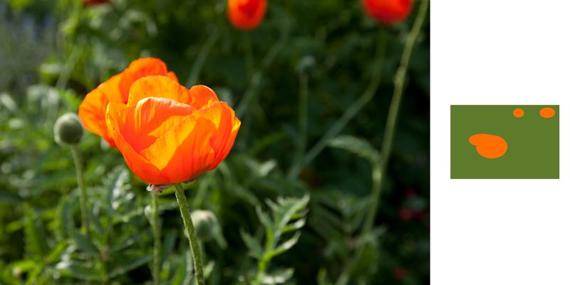
Accent:
This section demonstrates how a small amount of colour in an image can add drama giving weight to both the main colour and the accent colour in a way that wouldn't happen if the colours were more equal.

The next image with an accent of red against a largely green background makes the red bounce back at you. Red and green are complimentary when in equal proportions. Red however is a bright colour that tends to come forward in an image. In this image it is rather annoying. Especially the red plastic bag the man in the left hand corner is holding. Very useful to be aware of how a colour accent can equally ruin an image. Take care when framing picture that you have an accent you want and not something you are going to spend time in post production cloning out of your picture.
 The contrasting colours of yellow and blue are dramatic in most combinations. This image which I created by throwing a yellow balloon into the air creating a very simple picture could be a useful image where you want a page that you want to add text to. Both the yellow and blue appear more dramatic by the yellow being so much smaller than the blue.
 In this final image of a red accent on a very dull background shows how an accent of colour can make an image more appealing. The background is largely green but as it is a duller hue than that of the red the usual contrast relationship between red and green is different. Without the red umbrella the image is not very interesting. The accent of a bright red makes the red really stand out but also make the background colour appear more intense as well.


