The Art of Photography

Wednesday 27 October 2010

A Sequence of Composition

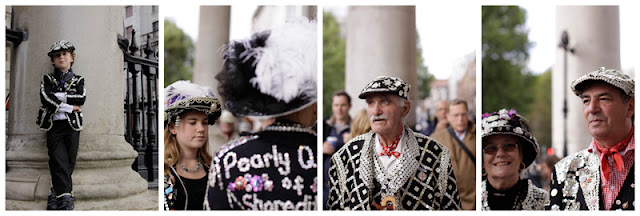
The image above is my final choice.  Why? Because it sums up the group and the event.  The elaborate hats worn by both men and women, but also this image shows the lineage.  A pearly princess as the focus of the image. The queen out of focus.  The elaborate hats. The younger's hat introducing a newer interpretation of the a pearly grand hat.


                                                                               Working backwards, what was I trying to say? How did I go about it.  I went to a couple of Pearly events to complete this exercise. The costumes are wonderful and I began by taking pictures showing a lot more of the costumes and with more people in the images.  I looked at parts of the costumes including the image focusing on one woman's bag.  However it was the hats that attracted me the most and that I felt I wanted to say something about.   I moved to these two women on the left and took a series with a different focal point.                                                                   Then when the princess walked into the scene I knew that this would say more. I have the glamour of the hats and the new generation. I chose to make the princess the main focus of the image.                                                                     
Below are the series of images I took as I was attempting to find the right composition.


Thursday 14 October 2010

Object in different positions in the frame

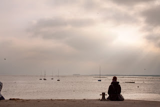
Of all the pictures in this exercise the one above is my favourite. The girl framed on the left hand side balances with the rays of the sun.  I also like the image below, placing the main object on the left hand side. The main problem with the image below is the sky has lost drama.  The sun went behind a cloud.

Finding a background with out too many distractions wasn't terribly easy.  The sun and light has changed in this series.  However for the purposes of this exercise the subject remained in the same place, thus enabling me to place her in various parts of the frame. This is another exercise I have done a couple of times, each time taking more time to think about where I want the subject to be and why. 

What I do need to pay more attention to is the edges of my frame. I'm getting messy corners.


The picture above has the girl in in the centre of the frame.  Your eye is drawn to this part of the image leaving dead space on the left hand side.
When I moved to place the girl in the right hand side of the frame it did not resolve the problem of empty space.  Although the bollard (is that what they are called?) just sneaking in on the bottom left hand corner is a distraction that needs to be cloned out.  (I left it in to remind myself to take more care when framing this type of scene. )

The same scene in portrait is not so interesting. My least favourite is the one on the far right. The girl is in the centre of the frame with roughly equal amounts of sky, water and foreground. Although this is the supposed thirds rule it really doesn't do anything for this image.  The first portrait picture I think benefits from tight cropping (2nd from left), although the image is now just a dark blob. (I had chosen to make the person a silhouette and now as it is so dominant it really needs more detail. The third image would have been better if the sky had more interest and drama in it. The sun has become a burnt out corner of the image with little to offer the picture.  This looks better when cropped just above the mast of the boat.

Wednesday 13 October 2010

Fitting the Frame to the Subject


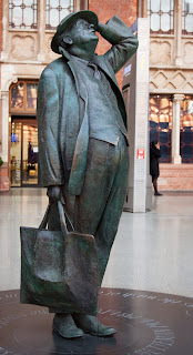
I had lots of ideas for this exercise and did it several times. Each time I became increasingly aware of how I look at a subject.  The first shot above was taken without any thought.  Just rock up at the station and take a picture of a statue. Result: a snapshot.

 The second step in this exercise was to fit the subject into the frame as tightly as possible.  Bit tricky not chopping off his feet.

What do I think of this shot? Fine for a manual on statues. you can see what/who it is. But does it spin my wheels?
No.

The next part of the exercise was to get in close and not show any edges.  I took several pictures here.  The obvious ones, Head, feet (I'm always taking pictures of shoes and feet).  Then chose just the hand and part of the satchel. (see below)

I liked this image the most.  It is relevant to both the man and the environment. I like the colours and textures.

Closing in like this can make a very strong image which I think it does in this case.


The requirements of the fourth image was to stress the environment .  Obviously I am in a railway station, but how to stress this.  Stairs, escalators, barriers, restaurants all presented a challenge as to where the best position to take this would be.  I took several pictures from different angles. Lighting was also a bit of a challenge.  I decided on this shot making the statue a silhouette, bringing in the train and a traveller passing by.

I think it works. It is clearly a railway station to the viewer.

Next we are asked to crop this last image in various ways. Each crop below makes the story different. Is the man saying good-bye. Is he looking for his train? Is he just another commuter.  How you decide to frame the same subject can make a big difference to the story you are trying to convey.


I've learnt a lot from this exercise. Stop, look, look again, but most of all think about what you want to say.

Friday 8 October 2010

Panning


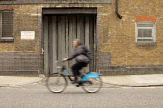
Took me awhile to get the hang of this. I found it easier to hold the camera rather than have it set up on a tripod. I also found that if you place your feet where you want to end up then twist your body to the start it makes following through easier and keeps the picture straight.
The collage above have shutter speeds 1/30 - 1/20 - 1/15 (reading left to right).

Below is another image taken at 1/50th.


Comparing images from the shutter speed exercise and this one I like the images at the slower shutter speeds.  They give a greater sense of speed. The blurriness seems less important in telling the story of my cyclist speeding up and down the street.

Of the two techiniques I think panning gives a greater sense of speed. The blurred background really gives the sense of whizzing by.

If I was photographing the Tour de France I might like to show it with two photos. One blurred to stress the speed they ride at and another to identify the rider.  However this second one could  be a portrait.

Shutter Speeds

 Shooting info:
TV: 1/160
AV: 4.0
ISO: 1000
Focal Length: 24.0mm
 Shooting Info:
TV: 1/50
AV: 4.5
ISO: 500
Focal Length: 24.00mm
Shooting info:
TV: 1/10
AV: 5.6
ISO: 160
Focal Length; 24.0mm


Camera set up on tripod at fixed focal length.  Early evening on a grey day against dark building was limited light.  I've changed the ISO to try and keep the AV reasonable similar through the series of approx 24 shots at a range of shutter speeds from very fast to very slow.
I've selected three out of the series to highlight the difference.
At 1/160th the action of the cyclist is frozen. At 1/50th there is a sense of movement but the cyclist is still identifiable.  However at 1/10th the cyclist is now like a ghost passing by.  However this does give a greater sense of speed.
Timing is tricky for each of these. I was aiming to catch the cyclist in front of the wooden doors each time.

Tuesday 5 October 2010

Various Apertures

Image 1: AV 16
Image 2: AV 4.5
Image 3: AV 1.4

Focus point = tail light on third bike.

The first image is sharp from close up all the way to the distance.
The second image is not as sharp in the distance.
The third image at such a wide aperture the area in focus is limited to the area around the focus point ie the tail light on the third bike.
 Note the difference in this image to the previous post. At a wide open aperture it is very important to know exactly where you want your focus point to be.

Focus with a set aperture

Settings:
AV: 1.4

In each of these images the I have focused on a different bike.  The first image I have selected the furtherest away bike. The second image the middle bike and the third image the closest bike.
For this subject the third image focused on the closest bike is my preference.  In the other two images it is harder to know what the image is trying to portray.  When focusing on the first bike (image 3) it is clear that it is a Barclay's bike even showing the ID of the particular bike. Having the rest of the line of bikes out of focus tells the viewer that the are many bikes without confusing the image.  It also puts the car at the back of the image so out of focus it doesnt' detract from the picture.  In the first image the car is clear to the point of detracting from the image.

Friday 1 October 2010

Project: Getting to know your camera


Shooting Data:
AE priority
TV: 1/160
AV: 8
ISO: 100
Focal Length: 200mm

At this focal distance I am almost in the apartments.
(Edges are cropped as I am using a full frame lens on a 50D)


Shooting Data:
AE priority
TV: 1/160
AV: 8
ISO: 100
Focal Length: 50mm

This image is closest to what the eye sees naturally.


Shooting Data:
AE priority
TV: 1/200
AV: 8
exposure compensation: +2/3
ISO: 100
Focal Length: 20mm

At this wide angle I can see a lot more. At the edges of the frame the buildings are distorted.