At last the final assignment for this paper has come together. The brief is applying the techniques of illustration and narrative as if a story for a magazine. including a cover followed by several pages telling the story.
The work I am presenting is the result of several months work. It is by no means finished but the beginning of a body of work I intend to continue with it for some time. Photographing the lives of those on the street is not the sort of work you can plan to just pop out one afternoon and shoot. I have spent months getting to know the people who live on the edges of society's expectations. All of them are fighting addiction of some sort. Alcohol, drugs and mental health issues. I have learnt a lot about friendship and trust. I am often astounded by the actions of so called ordinary members of the public. Why is it necessary to physically attack someone who asks for a few coins. Isn't "no" sufficient?
I began this work taking lovely snaps. The deal was I took their photo and gave a print in exchange. The problem with these pictures was they looked like they belonged in a family album. I still take these pictures as there is a need for this family album. Now though I am permitted to take pictures that reflect more of life as it is. I am learning their individual stories. My next step is to record their stories. First I want the story of how they arrived here. Then I want to follow where they go.
Mickey, for example told me how after 19 months in the hostel and coming off his drug habit had moved into his own apartment two days earlier. ( His partner wasn't so lucky, she died.) However he now feels isolated and lonely. I've heard this story several times now. Coming back to the street for companionship.
In presenting this narrative for my assignment using all of the skills I have obtained over the past year, the hardest was editing. I have become so close to my work it is incredibly hard to be objective. I sought the opinions of several other photographers (and my tutor) to help me be objective. I still can't believe I have been as ruthless as I have. This final selection does NOT include my best portraits! Leaving them out initially felt like cutting off my hand. What I had to do was become more aware of the viewer. They don't know the people or where it is. I worked with prints on a large table shuffling images around to get a flow. I went back through my notes over the past year and considered each of the techniques I had studied. Contrasts, elements of design, colour, lighting techniques, narrative and story telling. Earlier mistakes have not been deleted from my learning log. I find it useful to look at my learning process. Going back through the years work I am pleased with my progress. For example even my most recent errors such as my first attempt to put an essay together. The layout is dreadful.
My selection is now of images all the same orientation. I found on a previous assignment it is very difficult to jump from portrait to landscape and back again. All the pictures are taken outside only using ambient light. This changes so I have selected only those where the colour of the light is similar. The final selection have a dull day, grey/blue feel to them. I reshot the environment pictures to reflect this as well. I have chosen those with similar colours. I rejected a fabulous portrait as the colours were orange tones making the image stop the flow of the narrative. I have used a variety of wide shots and close ups to help me tell the story.
Putting the narrative together I selected one of the images to be the cover, my lead photo to draw the reader in. I begin the story with the local store where high alcohol beer is sold very cheaply. I've included group and individual images. The sign on the edge of the square prohibiting drinking on the street. Just across the road from a pub. They don't drink at the pub it is too expensive. Most pubs will have people gathered on the street outside drinking. A person from the street caught drinking on the street will be issued with an ASBO. My closing image shows the abuse often received as a result of asking for money. This is the image I want the reader to go away with. Hopefully to question their own attitudes and actions.
Friday, 23 December 2011
Thursday, 22 December 2011
Wednesday, 14 December 2011
Rain

Rain is difficult to photograph so you need to have an image that shows the effects of rain. Lots of umbrellas is the easiest image to show rain. When I took this image I was after something that would show how unpleasant the conditions on the day were. His rain coat is sticking to him, his glasses have rain drops on them and his face shows he is not exactly happy.
I have had ideas to create a newer image but I haven't had the rain I was after and so far haven't found a willing model. I have a vision of someone caught in the rain absolutely drenched with their hair clinging to their face and raindrops falling off their nose. I'll continue to try and get that image (I can post in my next paper).
Monday, 5 December 2011
Juxtaposition
The option I have chosen to use to illustrate juxtaposition is to use the still life approach creating a book cover. I have opted for very strong subject matter using symbols to suggest a relationship. The relationship being the mutilation of a young girl and men's sexual power over women. The sole reason that young girls are subjected to this cruelty is for men's pleasure and their power over them.
I recently read an article in the newspaper that 3.500 young girls in London are subjected to genital mutilation each year. I spent a lot of time thinking about how I could create a visual image that would connect the abuse of young girls to the sexual politics of men over women. A barbie doll seemed to me to cover the later. After reading that girls are generally violated with razor blades, scissors or even glass I decided on the symbols of a girls panties with a razor blade to represent the abuse.
I have used several tools to illustrate juxtaposition. Viewpoint, symbols, lighting and colour. I've used a wide aperture to create a soft focus that aids the sense of the doll being an image of a woman. I have place the razor blade just below the print of a fairy on the panties to create the sense of lost childhood and chosen red as the background colour to represent the amount of bleeding that will occur. I've used lighting to have lots of shadow and black edges to imply that this is something hidden, not spoken openly about, yet the communities in which it happens all know about it.

Tuesday, 29 November 2011
Symbols
Find symbols for a number of concepts describe how you might use them in a photograph.
Our subjects are:
growth, excess, crime, silence and poverty.
I have found this challenge very interesting. I've carried a notebook around with me for several weeks while I thought about this. I was trying to think of symbols that are different not a cliche. Well that is extremely difficult. I've spent hours in the bookstores looking at book covers to see what ideas have already been used. For example crime novels tend to have either a dagger, drops of blood, a murder victim or graphics on the cover.
I also thought long and hard about how the photo might be used. I was reminded of the HSBC ads where they use an image and show it can mean the opposite depending on the culture. I thought of where this could happen within my subject range. An example is a photo of a child's hand in an adults hand. This could indicate growth on the cover of a political manifesto. Equally it could imply crime in a police poster.
I thought of various symbols for each subject. I then went through my photos to see if I could find images that might be able to be used. I came up with the following:
Growth:
The industrial bee is often used as a symbol of hard work so I felt a good symbol for growth. I thought of many other symbols that are often used to represent growth. Plants, money modern skyscrapers. These are all positive symbols of growth. I then thought about growth as a negative and thought of cancer, over population, a different symbol would need to be used for these subjects.
Excess:
 The first thing that came to mind was Versailles. A photo of the mirror hall makes one think of excess. A table groaning with food. A fat stomach overflowing out of pants with shirt buttons bursting.
Crime:
 When I thought about symbols for crime I came up with a list of objects like padlock, barbed wire, security cameras, all things that hint at protecting oneself or defending oneself. Then I thought of objects like a knife or gun, things that hurt one. Most images relating to crime do so in a violent way. I then thought about a business man dressed nicely carrying a briefcase to symbolise what is termed white collar crime. Most symbols used do so by working on fear. So I used the picture above, with two symbols often used to demonstrate crime. The look of fear in the little girls face and the way she is clutching her handbag, a symbol of possessions. Is she afraid for her possessions or her personal safety.
Silence:
 I immediately thought of a church for silence. A place where one contemplates. I also thought of a graveyard. I have combined the two in the above image and have by use of a slow shutter speed added the figure of a man so that he appears as a ghost.
Other symbols that came to mind were a finger to ones lips, a person signing (the silence of the deaf). I also thought of a butterfly, a white room with a single white chair in it.
Poverty:
 This is perhaps a little too obvious as an image for poverty. A bit of a cliche. But probably most of my ideas for this subject do come into that category. I thought of a darned sock, a shoe with the sole coming apart. Discarded furniture, a broken pushchair. I then thought of a dinner plate with baked beans and a fried egg on it.
Overall though this exercise has been really good for making me think about how I am going to get a picture to say what I want it to. It's no good my knowing what was happening if my image doesn't say it to the viewer who wasn't there. All the exercises in this module have made me think a lot about what pictures I need to take for the final narrative. Actually they are making me think in general about my pictures. What do I want to say, how am I going to get it really display those messages/emotions.
Our subjects are:
growth, excess, crime, silence and poverty.
I have found this challenge very interesting. I've carried a notebook around with me for several weeks while I thought about this. I was trying to think of symbols that are different not a cliche. Well that is extremely difficult. I've spent hours in the bookstores looking at book covers to see what ideas have already been used. For example crime novels tend to have either a dagger, drops of blood, a murder victim or graphics on the cover.
I also thought long and hard about how the photo might be used. I was reminded of the HSBC ads where they use an image and show it can mean the opposite depending on the culture. I thought of where this could happen within my subject range. An example is a photo of a child's hand in an adults hand. This could indicate growth on the cover of a political manifesto. Equally it could imply crime in a police poster.
I thought of various symbols for each subject. I then went through my photos to see if I could find images that might be able to be used. I came up with the following:
Growth:

The industrial bee is often used as a symbol of hard work so I felt a good symbol for growth. I thought of many other symbols that are often used to represent growth. Plants, money modern skyscrapers. These are all positive symbols of growth. I then thought about growth as a negative and thought of cancer, over population, a different symbol would need to be used for these subjects.
Excess:

Crime:

Silence:
Other symbols that came to mind were a finger to ones lips, a person signing (the silence of the deaf). I also thought of a butterfly, a white room with a single white chair in it.
Poverty:

Overall though this exercise has been really good for making me think about how I am going to get a picture to say what I want it to. It's no good my knowing what was happening if my image doesn't say it to the viewer who wasn't there. All the exercises in this module have made me think a lot about what pictures I need to take for the final narrative. Actually they are making me think in general about my pictures. What do I want to say, how am I going to get it really display those messages/emotions.
Monday, 28 November 2011
Lens - Sharpness
I've been struggling for a wee while now trying to understand why my images have not been sharp. I've changed to TV to ensure I keep my shutter speed high to avoid camera shake. Tried different ways of focusing. Still wasn't ok. Finally decided to get my lens checked. Eureka! Problem with my lens. Canon have replaced power diaphragm unit, image stabiliser unit, rear lens unit, adjusted optical unit set to standard. No excuse now for unsharp images.
Sunday, 27 November 2011
Exhibition - Amazon
Amazon on at Somerset House is truly inspiring work. Photographers Sebatiao Salgado and Per-Anders Pettersson commissioned by Sky and WWF spent 3 years creating this work which aims to help save part of the forest in North-West Brazil. The photos are huge, stunning landscapes and powerful portraits of indigenous tribes. Although this project took three years these two photographers have been taking images in the area for a lot longer. The more I see these truly powerful exhibitions i realise that the best work comes out of projects that take years and years. The magazine that accompanies this exhibition (unbelievably is free!) I am studying for presentation.
Friday, 25 November 2011
Notes to exercise - A narrative picture essay 2nd attempt
My first attempt at a photo essay wasn't great, I know that but couldn't put my finger on why. I asked my tutor for feedback. Other than the obvious way the sw has put a strange version on my blog with loads of blank spaces was the layout. Not in nice neat columns. One of his suggestions was to study magazines and newspapers. So I did.
I'm still working through the sw issue. I just have to learn more and find free sw that will work for me. Not a bad option.
Note to myself: Learn how to achieve what you are trying to do with the tools you have. By the time you can afford the expensive sw you will know exactly what you want to use it for.
I've spent hours browsing magazines and book covers in stores. Studying the layout and how the subject matter is treated. Keeping in mind the next exercises I need to complete before the final assignment. I have put together another photo essay (in the post below). I'm happier with the layout, I need to think more about the comments and how the photos link together. The story I'm hoping to tell for my assignment will be strong so I need to think a lot about the images I need to connect them all. I'm becoming increasingly aware of how strong images put together well stand out from those around them. Since doing this study I'm becoming more aware of everything around me.
Tuesday, 22 November 2011
Saturday, 12 November 2011
Exhibitions - James Hyman Photography
A small selection of photographs from three very different photographers: Eugene Atget, Anna Fox and Lynne Cohen. The works of Eugene Atget were difficult to look at properly as they were in the office of the gallery staff (bizarre really) they were having a meeting so a little awkward to stand in front of the images for very long. However it did make me do a google search to view more of his works. A couple of his staircase images in the gallery I particularly liked. The lines, shape and light all come together brilliantly.
Anna Fox was my favourite in this exhibition. The images were part of her project Resorts, a view of Butlins holiday camps. Funny I had been thinking of a similar body of work, should have known this would have been done, (probably done lots). I do love this style of work and have slowly been finding the photographers who work in this genre. Martin Parr, Peter Dench and now Anna Fox. What I especially love is that in some ways they have the initial appearance of a family snapshot but when you study them they are far from that. They give a real glimpse into real family lives, the colour is an important element of the images and often are big and bold. I wonder how they will be viewed in 100 years. I can't help but feel they will be of more interest than the beautiful landscapes that are taken during the same period.
The third photographer was Lynne Cohen a Canadian photographer with a selection of her work that featured at the Venice Biennale. These images as stated in the publicity blurb "explore the mystery of unoccupied space and place". I am learning to see more in this genre of images but still they don't inspire me. I get more out of images of people.
Monday, 7 November 2011
Workshop - The Picture Story
Did a one day workshop (organised through L.I.P.) with Martin Shakeshaft on the picture story. With 15 of us on the workshop with varying skills and Martin attempting to show us everything from successful documentaries to putting together a punchy small film we weren't going to be able to get lots of detail. Still we were encouraged to take a section of what we wanted and go with that. I chose to try and photograph a picture essay incorporating the important elements we had discussed in the morning session. If doing an editorial feature it would typically be between 2-7 images. The most important shot is the establishing shot. This image puts the story into perspective, places the story. It may be the only image used so must tell the whole story in that one image. Typically wide angle shot.
Next pace. A variety of images shot from different perspectives, long shot, mid shot, wide shot, close-up, relationships. Avoid boredom by changing the rhythms of the photographs.
We regrouped at the end of the day to discuss what each of us had done. I found the establishing shot extremely difficult. Martin told us this is always the hardest shot even for those who have been doing it for years.
For me these are all elements I will need to incorporate into my photo essay.
Wednesday, 2 November 2011
Evidence of Action
For this exercise we are asked to take just one photograph in which it can be seen that something has happened. The reading suggests that this image should be powerful. Something that tells a story in just one image.
I have just such a photo that I took after the riots.

I went to Brixton after the riots. I think this image is as powerful as many of those the media took of action shots at the time of the rioting. This image shows what happened. Even those caught up in the heat of the moment would have to reflect when seeing the results as shown here. Shortly after I took this photo most of the shop windows were boarded up, which in many ways hid the problem.
Tuesday, 1 November 2011
Notes to exercise - A narrative picture essay
I had decided to use the Bloomsbury festival as my practice exercise as I work toward the Assignment 5. I tried to get a variety of pictures that would give the viewer a feel for the day, including a portrait, detail and the scene. The festival is mostly art and culture involving organisations and museums in the area.
The next part was to edit the photos down to between 5 and 15. I found this difficult especially as some of the photos weren't technically very good. What do I do? just use technically good pictures or put in those that tell the best story? I opted for the latter.
Now layout. Geez, I've no idea how to layout. I printed the pictures in various sizes and laid them out on the table trying to find groupings and sizes that worked best.
Next captions. Now I'm way outside of comfort zone. Hence the brief captions.
How do I now get if from scraps on the table into some kind of document. I finally went with MS publisher and saved as a pdf.
More hours on the Internet to find how I could get this into my blog journal. I tried a couple of sites where you upload your document then copy the code into blogger. First attempts had parts of pictures and loads of frustration. More research. Finally found Scribd.
Seems to work reasonably well without too many problems.
Feeling more than a little concerned about the final assignment.
Monday, 31 October 2011
Exhibition - UK Poverty Photo Exhibition
After seeing some of Liz Hingley's work and listening to her speak at the Canon Expo I was keen to see the body of work commissioned by 'Save the Children' for their UK Poverty Campaign. Just showed for three days at House of St Barnabas. Six photographers have each taken images around the UK depicting poverty. I found this to be a very strong body of work and incredibly moving. In a way that brings you closer to the people. You feel as if you have met them all yourself. The work isn't presented in a way that makes the families victims. Work like this is what I would like to be doing. Stories told like this really make you want to do something. To change political decisions. Visual stories have such strong impact. Talking to one of the organisers after seeing the work was enlightening too. She has worked in this area for many years and even she was moved and shocked by this work. That is an indication of how brilliant this work is. We discussed the problems of being able to finance bigger exhibitions of this work. Something to consider if doing work like this is how and who is going to fund it.
UK Poverty Photo Exhibition.
UK Poverty Photo Exhibition.
Wednesday, 26 October 2011
Canon Expo
Last year I went to the Canon Expo (at the business centre in Islington High St) and spent most of the time fondling products. This year I went and mostly ignored the sales side and spend the best part of two days going to the seminars. A couple are showing you products. i didn't attend those ones. The draw card for mw was Martin Parr. I have long admired his work and wanted to hear the man in person. I was really disappointed. He is not an inspirational speaker, I found him rather arrogant and condescending. But I was lifted by Peter Dench. I guess you could say he has modelled himself along similar lines and style to Martin Parr, but he is a very entertaining speaker, humble about his work, which is exceptional.
IThe other photogrpaher who really inspired me was Liz Hingley. A young photographer that already has loads of accolades and awards. Her work is closer to what I aspire to do, working closely with individuals or communities. She has gone to extraordinary lengths to get her pictures. Her project on religon is incredible as was her process. She joins the community she is photographing and lives along side them while taking her pictures. I'll be following her in the future. Her link for my reference:
http://www.lizhingley.com/
Thursday, 20 October 2011
Exhibition - Me
I have two of my smoking pictures on the walls of the Strand Gallery in the L.I.P. annual exhibition. Also have had another two selected for the LIP Shoreditch exhibition (part of photo month). Next goal is my own show.
Wednesday, 19 October 2011
Assignment Four - Applying lighting Techniques
Finally I have the work to hand in for this assignment. It has taken me forever. Mainly as I decided to make the work I am currently doing with photographing strangers on the street smoking, fit the project. This has not been easy. It has meant I am not totally in control of every situation. I obviously don't have a studio set up. I thought a lot about how I would show each of the four categories: shape, form, texture and colour. A few weeks ago I convinced someone on the bus to be a model in an abandoned car park for an idea I had in my head. To work with I had a flash on a stand, some gel and a reflector. Also ambient light. Shape I decided to do in the most obvious way, a silhouette against the night sky. Texture and form I wanted to make use of the brick walls and broken fence in the car park. Colour I had in my head this idea of making the smoke blue and the smoker dark and moody. To do this I had a sheet of blue gel and an off camera flash. This took forever to get to work. I was on the brink of abandoning it. Why did I set myself something so difficult. However going back to my books. Trying to understand the angle of the light how to ensure it would be exactly where I wanted it when it fired. (No wonder hot lights are used in a studio, you know what they are going to do before they shot!) I talked to other photographers, I researched on the web. How do I get the light to just hit where I want. In addition the slightest bit of wind and the smoke would go in a different direction. My first attempts had eerie blue eyes burnt out forehead or spooky blue hands. Finally I worked out I need less gel, just a small sample gel taped across the flash. I had tried making a snoot to direct the light but that didn't colour all the smoke. What I did was change the zoom of the flash. Something else I have learnt. You can alter the width of the light with the zoom setting.
Ideally a second light with a very soft amount of light on the dark side of the portrait would improve the shot. However I don't have another light, also I am concerned about how many cigarettes he has already smoked for me in this experiment. What I was trying to achieve was to just light the smoke. This I have now done. This was the hardest part of this assignment. I am happy that adding additional lighting to the image would not be difficult and that I understand what it would achieve.
As the majority of the portraits for this subject are opportunist on the street I have added a second group of photos, each taken in a different place but taken to fit each of the categories, shape, form, texture and colour.
The work:
Group One - These are the planned shots
Shape - I have used ambient light at dusk. That time when the sun has gone down and the sky goes a rich blue. I laid down on the ground, metered for the sky but underexposed so it would be a very rich blue and the smoker would be a dark silhouette, just showing the outline with slight detail around the edges.

Form - I have used a hard light from the flash (not diffused) place at the side of the model to create hard shadows. The rest of the lighting comes from ambient light as the sun is going down. It is an overcast day (lucky I am in London and we have plenty of those) this gives me diffused light for the rest of the image. It is the hard light that creates the shadows that gives the depth to the image making it appear multi dimensional rather than flat. The aim to show depth. The framing of the fence, the wires and then the model are clearly multi dimensional. I also incorporated my learning from module 2 (elements of design) in the use of lines and triangles in the composition of this shot.

Texture - I have chosen a space with loads of natural texture then set the flash up to the side and slightly higher so the light shines down on the side of the model but also creates dark shadows in the broken bricks. I have reflected some of the light back with a gold reflector to ensure that the texture of the bricks is emphasised. The mixture of lights in uneven amounts ensures the textures of skin and hair are visible, as are the zips of his clothing. The broken bricks frame the smoker with a lovely complimentary curve.

Colour - The hardest of this assignment. My light set up here: Looks simple now but took me ages to get here. The orange of the bricks and the blue smoke also form Goethe's complementary colours even though in the opposite relationship that he says creates harmony. I think that there is a form of harmony. My comments for this image and the problems I encountered are in my opening statements. Mainly it took forever to get it right.


Group Two - these images are taken in various places at various times.
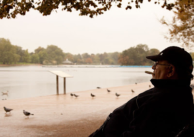
Shape - This image was one I had taken awhile ago, the man was smoking a replacement plastic cigarette to help him give up smoking. I took the picture with his permission. I wanted to have his shape looking out across the lake to show he was thinking, possibly about anything but the cigarette he wanted. I used the ambient light with the smoker as a silhouette with some but not a lot of detail in the shadow area. The use of shape in this image I feel evokes emotion. If I had fully lit the man then the picture would just be a portrait. By having him as a silhouette, the fake cigarette is more obvious and I feel it makes you think more about what he is thinking.
Form - I had been doing a lot of work on this assignment, thinking about each of the elements. It was a very dull overcast day except for a beam of sunshine that fell on this man. I didn't have time to get permission I saw the light and that he would only be in it for a short time. I could see it fitted form perfectly so just started shooting, trying to get myself into a position that would give a 3D effect. I needed. The light is shining directly on the man's face creating shadows behind his ear and the back of his neck. The light in the background is diffused by clouds.The background almost disappears, the colour of the light on his face and the shadows created makes gives depth and form and distance from the background.

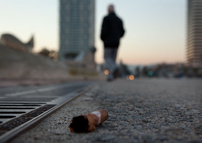
Texture - I saw the butt of the cigar on the ground. Evening light, the sun was disappearing and street lights were coming on. I had to lie on the ground to get this image. I wanted the texture of the cigar and the rough street to stand out and be a feature of the picture. I therefore chose a very shallow depth of field. The warm ambient light and street and car lights in the distance both frame the dropped butt and imply a story. Vertical and horizontal lines also form a strong part of this image including the implied line of the man and the cigar butt.
Colour - This image is just about colour. Very strong, bold colours. Although purple and yellow and orange and blue are regarded as complimentary colours, this combination with a large amount of blue and all colours very vibrant makes the relationship contrasting. When I took this picture it was night time and I had the person sit under a street light then used a flash with a lightsphere, to diffuse and spread the light directly front on to the smoker. I wanted to ensure that I didn't clip any of the highlights, so the image veers to underexposure. I have lightened and brightened in photoshop. I felt this approach would give more depth and vibrancy to the colours.

The second group of images is also about being able to use whatever resources you have available to you where ever you are. For my project on photographing strangers smoking I am generally not carrying a lot of equipment with me so have to look around me and think about how I can manage what ever light I have on hand and to manipulate it in any way I can. Using a wall or street light. I have even used car headlights.
Ideally a second light with a very soft amount of light on the dark side of the portrait would improve the shot. However I don't have another light, also I am concerned about how many cigarettes he has already smoked for me in this experiment. What I was trying to achieve was to just light the smoke. This I have now done. This was the hardest part of this assignment. I am happy that adding additional lighting to the image would not be difficult and that I understand what it would achieve.
As the majority of the portraits for this subject are opportunist on the street I have added a second group of photos, each taken in a different place but taken to fit each of the categories, shape, form, texture and colour.
The work:
Group One - These are the planned shots
Shape - I have used ambient light at dusk. That time when the sun has gone down and the sky goes a rich blue. I laid down on the ground, metered for the sky but underexposed so it would be a very rich blue and the smoker would be a dark silhouette, just showing the outline with slight detail around the edges.

Form - I have used a hard light from the flash (not diffused) place at the side of the model to create hard shadows. The rest of the lighting comes from ambient light as the sun is going down. It is an overcast day (lucky I am in London and we have plenty of those) this gives me diffused light for the rest of the image. It is the hard light that creates the shadows that gives the depth to the image making it appear multi dimensional rather than flat. The aim to show depth. The framing of the fence, the wires and then the model are clearly multi dimensional. I also incorporated my learning from module 2 (elements of design) in the use of lines and triangles in the composition of this shot.

Texture - I have chosen a space with loads of natural texture then set the flash up to the side and slightly higher so the light shines down on the side of the model but also creates dark shadows in the broken bricks. I have reflected some of the light back with a gold reflector to ensure that the texture of the bricks is emphasised. The mixture of lights in uneven amounts ensures the textures of skin and hair are visible, as are the zips of his clothing. The broken bricks frame the smoker with a lovely complimentary curve.

Colour - The hardest of this assignment. My light set up here: Looks simple now but took me ages to get here. The orange of the bricks and the blue smoke also form Goethe's complementary colours even though in the opposite relationship that he says creates harmony. I think that there is a form of harmony. My comments for this image and the problems I encountered are in my opening statements. Mainly it took forever to get it right.


Group Two - these images are taken in various places at various times.
Shape - This image was one I had taken awhile ago, the man was smoking a replacement plastic cigarette to help him give up smoking. I took the picture with his permission. I wanted to have his shape looking out across the lake to show he was thinking, possibly about anything but the cigarette he wanted. I used the ambient light with the smoker as a silhouette with some but not a lot of detail in the shadow area. The use of shape in this image I feel evokes emotion. If I had fully lit the man then the picture would just be a portrait. By having him as a silhouette, the fake cigarette is more obvious and I feel it makes you think more about what he is thinking.

Form - I had been doing a lot of work on this assignment, thinking about each of the elements. It was a very dull overcast day except for a beam of sunshine that fell on this man. I didn't have time to get permission I saw the light and that he would only be in it for a short time. I could see it fitted form perfectly so just started shooting, trying to get myself into a position that would give a 3D effect. I needed. The light is shining directly on the man's face creating shadows behind his ear and the back of his neck. The light in the background is diffused by clouds.The background almost disappears, the colour of the light on his face and the shadows created makes gives depth and form and distance from the background.

Texture - I saw the butt of the cigar on the ground. Evening light, the sun was disappearing and street lights were coming on. I had to lie on the ground to get this image. I wanted the texture of the cigar and the rough street to stand out and be a feature of the picture. I therefore chose a very shallow depth of field. The warm ambient light and street and car lights in the distance both frame the dropped butt and imply a story. Vertical and horizontal lines also form a strong part of this image including the implied line of the man and the cigar butt.

Colour - This image is just about colour. Very strong, bold colours. Although purple and yellow and orange and blue are regarded as complimentary colours, this combination with a large amount of blue and all colours very vibrant makes the relationship contrasting. When I took this picture it was night time and I had the person sit under a street light then used a flash with a lightsphere, to diffuse and spread the light directly front on to the smoker. I wanted to ensure that I didn't clip any of the highlights, so the image veers to underexposure. I have lightened and brightened in photoshop. I felt this approach would give more depth and vibrancy to the colours.

The second group of images is also about being able to use whatever resources you have available to you where ever you are. For my project on photographing strangers smoking I am generally not carrying a lot of equipment with me so have to look around me and think about how I can manage what ever light I have on hand and to manipulate it in any way I can. Using a wall or street light. I have even used car headlights.
Saturday, 15 October 2011
Exhibition - Biennale
Got a chance to fit in some of the Biennale in Venice. I love this festival. Always there is work I love and work that does nothing for me.
One body of work I saw was at the Palazzo Bembo - Personal Structures.
http://www.palazzobembo.org/index.php?page=28&lang=en
I also raced around the pavilion at Giardini. The problem is when you see so much is all becomes a blur and often what stays with you is what you don't like or the work that makes you feel uncomfortable.
I did take in the work of a photographer from South Africa, David Goldblatt. A body of work of ex offenders at the scene of their crime, he had their comments beside each image. I was particularly interested in how he composed the pictures and used their words. I was especially interested because of a body of work I am trying to do at the moment with addicts in London. The combination of images with the subjects comments rather than an outsiders comments I felt made the work much stronger.
Monday, 10 October 2011
Assignment Four Preparation
I have not totally disappeared even though I have not updated my learning log for nearly three weeks. I have been away. However I have been working on the final images. I've taken some images trying to get my lighting correct. I've been having problems trying to get the lighting corect. Ideally I need more than one light for what I am trying to do however trying to work with what you have is something one has to learn also.
Shiny Surfaces
Well this exercise was one way to get the housework done. I had to polish the tarnished silver egg cup to get the sheen back. The first part of the exercise was to take a photo of a shiny object on black velvet. The image below was taken with daylight coming from windows either side.
 I then attempted to make a cone with a sheet of gel. The result is below:
 I repeated with a light at the side.

 My cone was crumpling in the last shot so i have a bit of colour cast. However the point of the exercise was to see how to deal with reflections. The ideal for photographing this eggcup would be to use a tent designed for just such a purpose. Lighting outside the tent to keep the cup shiny blocking unwanted reflections.
I'll try and rig up something that will do a better job than my crumpling cone. Although the images aren't ideal i have grasped the principal in how to deal with unwanted reflections.


I'll try and rig up something that will do a better job than my crumpling cone. Although the images aren't ideal i have grasped the principal in how to deal with unwanted reflections.
Friday, 7 October 2011
Exhibition - Photo Quai
The 3rd biennale of photographers around the world organised by the Musee du Quai Branly in Paris.
All the photographers must be non Western. The aim is to give a chance and to compare the points of view, maybe challenge conventional views of photography. I found the work incredibly inspirational. Very varied. The photos are huge, outdoors along Quai Branly and in the gardens of the musee. Something powerful happens to an image when it is that big. I was also surprised at how such varied work could all hang together. Maybe it is because you have to walk around it over a huge space with everyday life going on around you. I don't know. It is a festival I will look out for in the future.
http://www.photoquai.fr/en/2011/photographs.html
Friday, 16 September 2011
Contrast and Shadow Fill
Understanding contrast and shadow fill. The images below were taken as follows:
I'll do this exercise again with a model when it is darker to demonstrate how much light can be controlled.

- No diffuser
- with diffuser
- with a white reflector about 3ft away
- with a white reflector close
- with a gold reflector
- with crumpled foil as a reflector
I'll do this exercise again with a model when it is darker to demonstrate how much light can be controlled.
Technical problems
Grrrr Hours spent trying to get paper profiles form Epson. They are the most unhelpful help desk ever. I have to download new print driver but their site crashes. The US site hase the icc profile I want but that just crashes as well. I recall having problems with their site before.Despite asking several times they will not email me the profile I need. Why? Because they can download it at their end. Such a simple request. I have spent too long trying to resolve this issue. Have had to resort to solution used in the past with Epson. Get someone in another country to download the file, zip it and email to me. Why Epson can't you do this??? Why can't you zip the file in the first place?
Exhibition - Terry O'Neill

Monday, 12 September 2011
More on the Lighting Angle

I want to experiment with adding a small amount of another colour into this type of shot if my idea for the assignment is going to work.
The Lighting Angle
Although I have been busy focusing on other projects in the past few weeks I had not totally abandoned the work required for this module. Lighting is one of the most important things to get right in photography. I've been reading several books on lighting. Researching on the web, Spending lots of time fondling lights at the lighting centre that are way too expensive for me at the moment. The book 'Light Science and Magic' has confused me more than helped. I've spent ages trying to get the family of angles into my head. I understand the general principal but trying to set up the positions is not as easy as I thought. I've had a few attempts to try and meet the brief for this exercise while also trying to apply the techniques I have been researching.
The images below are from one of my sessions. (my model had enough by the last picture and ran off. Says she doesn't want a career as a model. Guess my next session will be an object.)
Take a picture with the light front on. Yet you shouldn't have the light next to your camera. Light from behind, but you don't want to take a picture of the light! The solutions weren't immediately obvious to me, but I did get there, well somewhere on the way there after a few trials. Back lighting - turn the light around and light the area behind the model. Front lighting - put the light in front of the model but move your camera and have the model turn slightly so they are facing the camera. I need to experiment a bit more with this if I am to achieve the ideas I have for the assignment.


Friday, 9 September 2011
Recent events
A frantic time recently. My laptop became such a problem that Lenovo agreed to replace it. Finally have new one up and running. Takes forever to get all the sofware reloaded.
Finally handed in my project for my diploma course.
I've had 2 photos selected for the L.I.P. annual exhibition.
Now I can concentrate on getting caught up on assignment 4
Finally handed in my project for my diploma course.
I've had 2 photos selected for the L.I.P. annual exhibition.
Now I can concentrate on getting caught up on assignment 4
Thursday, 18 August 2011
Exhibitions - Project based
Two exhibitions I've seen this week that have made a big impact on me in terms of the powerfulness of a good project.
The first is Anders Ryman's work 'Rites of Passage'. A fantastic open air exhibition on near City Hall (Riverside). Seven years he spent on this project, travelling around the world, witnessing and photographing all sorts of rites of passage. They are incredibly powerful images, but also what a powerful subject. Something everyone can relate to no matter what culture or country you live in. You can relate to your own, even laugh at some of them. Others though can make you feel decidedly uncomfortable. To have taken the pictures he has he has to have spent quite a bit of time with people and gained their trust. In one shot he has to be inside the grave! (It was a reburial).
The other exhibition 'Words of the Century' at the October Gallery by photographer Jimmy Symonds. has produced has created 10 hand-made artist books for each decade from 1900. He researched new words from each year, reducing the list until he finally produced this exhibition of one new word or phrase from each year illustrating it with a photo. Examples are 'avant-garde' , 'cloning', 'down-turn'. Again several years have gone into this project. It is a really strong body of work.
Seeing these works a few days apart (while I am trying to think of my own project for assignment 5) I am so aware of how a well researched and good subject matter make all the difference to the final work.
Monday, 15 August 2011
Softening the Light
This exercise to take two pictures of a still life. One with the light diffused and one with the naked lamp.
The picture immediately below is taken with a naked lamp placed facing from the bottom left hand side angled down toward the still life. The result is: dark shadows in top left had side with no detail. Very log hard shadows. The centre of the jug is very bright. I had to take a couple of shots to ensure this area was not burnt out.


The picture immediately below is taken with a naked lamp placed facing from the bottom left hand side angled down toward the still life. The result is: dark shadows in top left had side with no detail. Very log hard shadows. The centre of the jug is very bright. I had to take a couple of shots to ensure this area was not burnt out.

Naked Lamp
The second image taken with exactly the same set up but with my new softbox to diffuse the light has softer more evenly distributed light. The dark shadows from the first image are now visible. the shadows created by the light are much softer and smaller. 
Diffused Light
Conclusion: The diffused light is more pleasing, however the naked light does give a sense of drama that I rather like. I don't like the harsh shadows. I will experiment to see if a second light would soften the harsh shadows but keep the dark edges to the image.
Saturday, 13 August 2011
Softbox
Ok I've now reached the point where I have to do something about photographic lighting. I knew this was a point I would reach and have been doing loads of research. Where I have arrived is: I have saved enough buy a really good light a bravo 1000w quartz halogen for £179. I already have a light stand. I cannot believe the price of a soft box! About the same price as the light.
So I have to make one.
I can do this.
The idea came. Tinfoil trays. So a trip to Robert Dyas. 2 sets of large trays @ £1.99 each 1 set of flan dishes @ .99p duct tape £4.19.
Joining the trays wasn't as easy as I thought. Tape didn't work. Stapling didn't work. I must have something that will work. Filing clips! Perfect. Strong and metal. Yeah! Then I pulled them into the flan dish. took a couple of goes but I had these tiny clips in my scrapbooking box that secured those. A sturdy frame has now been created. popped down to the corner store for a roll of tinfoil .59p wrapped that around my structure. Fits perfectly on my light.
Now to diffuse. I have bought a couple of sheets of gel @ £3 each. I attach them with little paper clamps at the top. then back to my scrapbooking box. I have small 'sticky hoop & loop pads' I use a combination of these and paper clips to attach the gel.
Result: OK
And: it is kitset, I can take it apart and put it back together.
Total Cost: £12.75

Wednesday, 10 August 2011
Outdoors at Night
An exercise in looking at various lights at night time. Artificial lights come in so many colours and generally you will get several different lights in the one place, making it very difficult to get the colours right. Although the various colours can be the main objective of the photo as in light trails.


Taken in the evening from a pedestrian over bridge. All with a shutter speed of 8secs aperture F11. I have changed the white balance to see the effects. From the top going down Auto WB, daylight and fluorescent. AWB gives the most realistic colour but not are perfect for all the colour. Given the range of various colours my approach would be to shoot awb and adjust in post processing as different parts of the image require different adjustments.

- a floodlit building

- a brightly lit store front

- a large interior with many people

white balance = auto

white balance = daylight

white balance = tungsten

white balance - fluorescent
- A raised view looking along a busy road
Taken in the evening from a pedestrian over bridge. All with a shutter speed of 8secs aperture F11. I have changed the white balance to see the effects. From the top going down Auto WB, daylight and fluorescent. AWB gives the most realistic colour but not are perfect for all the colour. Given the range of various colours my approach would be to shoot awb and adjust in post processing as different parts of the image require different adjustments.

Monday, 8 August 2011
L.I.P. Workshop
Did a great workshop on Saturday on Hampstead Heath. Our brief was to take a portrait of a stranger and get their name. A photo essay of up to 6 pictures and a seires of up to 6 pictures.
I chose the ice-cream van. This is my portrait and essay. The day was fun and we learnt a lot from one another as well as the facilitator. (Brian)
Get close up and detail but also get a wider picture that gives you context. I'm not feeling quite as worried now about assignment 5

I chose the ice-cream van. This is my portrait and essay. The day was fun and we learnt a lot from one another as well as the facilitator. (Brian)
Get close up and detail but also get a wider picture that gives you context. I'm not feeling quite as worried now about assignment 5

Friday, 5 August 2011
Technical Problems
Days and days have been consumed with rebuilding my laptop. New motherboard (second time) reloaded windows. Slowly getting everything back on and working. Screaaammm. Can do without these kind of problems.
Tuesday, 2 August 2011
Dance - Carlos Acosta
Saw Carlos Acosta and Zenaida Yanowsky at ENO on Friday. I love dance and this was fantastic. I am including it here on my learning log as what particularly wowed me was the lighting. The piece choreographed by Russell Maliphant with lighting design by Michael Hulls I especially loved. The way the lighting isolated Carlos's muscles just capturing the edges. How did he do that? I found my self studying the lighting through the entire production. I made a couple of very rough drawings of lighting I want to try out as part of assignment 4.
Thursday, 28 July 2011
Cloudy Weather and Rain
The first part of this exercise is to take two-three scenes and photograph them on a cloudy day and a sunny day. Each of the three sets below the image taken on a cloudy day is on the left and the sunny day on the right. Each of these sets shows quite clearly how the clouds act a s a diffuser, softening the light and reducing the shadows cast. I took all photos at roughly the same time of day. The images taken on a cloudy day are also slightly bluer. I had used daylight setting for all images. The available light is also reduced on a cloudy day, especially the image of the tombs on the sunny day the sun bounced off the stone making it incredibly bright. On the cloudy day I need to use a very high ISO as well as wide aperture and slow shutter speed. The differences were actually greater than I had expected them to be. However I do prefer the images taken on the cloudy day. Rather fortunate living in London where we have more cloud than not.
 Cloudy - TV 1/40 AV f6.3 ISO 500 Sunny - TV 1/160 AV f8 ISO 200
 Cloudy - TV 1/160 AV f8 ISO 500 Sunny - TV 1/200 AV f8 ISO 200
 Cloudy - TV 1/40 AV f4.5 ISO 800 Sunny - TV 1/250 AV f8 ISO 400
The second part of this exercise is to identify two photos in my library that would definitely not be better in sunlight. The first I have selected is the beach scene below. On a bright sunny day with blue skies this picture would not have the same moodiness that it currently has. the sand would be brighter, the atmosphere would be a totally different place. The sport would look out of place.

The second image would definitely be very different on a sunny day. This picture was taken in the afternoon without any shade near by. A sunny day would have given hard shadows on her face. It was very overcast, perfect for such beautiful young skin. The slight blue cast was very welcome as she already has a lot of red in her skin. Sun would have increased the warmth and changed the gentleness of this image. I was very grateful for the cloud on this day.

The third part of this exercise is a photo in the rain. I love taking pictures in the rain so have used one from my library. This day I went out just to take pictures in the rain. It was particularly heavy rain. I'm always looking for that special shot that will really show the rain. I think this does give a feeling of a sudden down pour, although I still haven't captured the density of the rain I am after. there is a lot more reflection and glare in the rain so when there is wet pavements or pools of water on the pavement you have to make sure you don't get burnt out patches. I now have a raincoat for my camera to let me out in this weather.

Wednesday, 27 July 2011
Dawn to Dusk
I haven't got the greatest images for this exercise but I do understand the concept we are to learn from this. I am tired of getting up at 3:30am to get the dawn shots. (I'll never make a landscape photographer). Pity it isn't winter time when the days are shorter. The first shot is 4:06am the last 21:11. Taken over several days where the weather was similar. ie not totally overcast with grey skies.
The area directly in front of the camera is where the sun sets. So my dawn shots are reflecting the light from the sun. I like this type of light both at sunrise and sunset. As the sun travels through the day the light gets whiter. As I am facing straight into the sun that sets behind the buildings the sunset pictures are not as warm as they can be if the sun is slightly out of the frame. In this group of pictures at this location the images I prefer are those taken between 8:30 am and 11:00 am (2nd row). The sun gives a warm glow to the bricks. This will vary depending on the location and where the sun is in relation to the subject and what the subject is. However the light is richer (and nicer I feel) closer to both sunrise and sunset.

I particularly love the light just before sunrise or just after sunset as in this image of St Paul's Cathedral (taken after sunset).

Tuesday, 26 July 2011
Variety with a low Sun
For this exercise the brief was to take four photos when the sun is low using daylight white balance.
The results are image top left, front lighting. The result is harsh shadows on the models face. plus she is squinting as the sun is shining directly into her eyes. The image top right has the sun behind the model. harder for the photographer as you are shooting directly into the sun. I recall comments from a photographer when talking about his fees. Double if shooting into the sun. As the background was going to be burnt out I chose a very wide aperture to make it even less important to the picture. The sun behind is more flattering to the model with no harsh shadows on her face. The bottom left hand photo is using the sun to side light. This was also difficult with the grass on the sun side of the image burnt out and the models dark clothing losing detail. i do like side lighting for portraits but with a little more control so that the light is diffused. The final image, bottom right hand corner is using edge lighting. I decided to take this image so that the edge lighting would not be burnt out. This meant that the rest of the image would be underexposed. To be able to see the models face I would need to use flash in this situation if I want to keep all the detail in the lighting around her hair.

The results are image top left, front lighting. The result is harsh shadows on the models face. plus she is squinting as the sun is shining directly into her eyes. The image top right has the sun behind the model. harder for the photographer as you are shooting directly into the sun. I recall comments from a photographer when talking about his fees. Double if shooting into the sun. As the background was going to be burnt out I chose a very wide aperture to make it even less important to the picture. The sun behind is more flattering to the model with no harsh shadows on her face. The bottom left hand photo is using the sun to side light. This was also difficult with the grass on the sun side of the image burnt out and the models dark clothing losing detail. i do like side lighting for portraits but with a little more control so that the light is diffused. The final image, bottom right hand corner is using edge lighting. I decided to take this image so that the edge lighting would not be burnt out. This meant that the rest of the image would be underexposed. To be able to see the models face I would need to use flash in this situation if I want to keep all the detail in the lighting around her hair.

Saturday, 23 July 2011
Rise Above it All
No wonder I haven't had any feed back from my last assignment or replies to my emails. My tutor is ditching me. Seems her interest is only in working with conceptual ideas at a high level. Terrific. I'm told in an email that my new tutor will be in touch soon. Should I point out that this news was delivered by someone who doesn't know the difference between there and their. Feeling confident? Obviously I'm not. Thinking I picked the wrong school? You bet. I'm struggling to know if I should carry on with this course or ditch it now and put my effort into a few courses I have found that look really good. Feeling like I have wasted weeks playing around with research and reading to try and 'conceptualise' now feel annoyed that I could have been moving on and be up to date with exercises in the program.
Up and onwards will see how I feel in a week.
Up and onwards will see how I feel in a week.
Tuesday, 12 July 2011
Dawn to Dusk
This exercise is proving to be troublesome. I am exhausted getting up at 3:30 to get sunrise only to find the weather unsuitable. London is too cloudy!! I am becoming an expert on how much cloud and when it comes in, how fast, how long, what shape. Think I will move on to the next exercise. I'll have to come back to dawn to dusk when I can get better weather, which may mean outside of London.
Monday, 11 July 2011
Judging Colour Temperature 2
As for previous exercise these sets of photos were taken Midday Sun, Midday Shade, sun close to the horizon. Three photos taken at each time with three different white balance settings. AWB, daylight, shade.
Note the differences:
AWB in each set gives a slight blue cast. Shade white balance gives a golden glow. A bit too warm for my liking. At each time and condition I prefer the daylight setting. (one I tend to mostly use as well). I may have had a different outcome with a different subject and in a different environment. London either has a lot of cloud which diffuses the light or if it is a bright clear day then there is a pollution haze. Both tend to cool the colour and give a very slight cast. Hence why I opt for daylight setting for most of my outdoor shots in London. I will redo this exercise when I am out of London next.
Each set left to right are AWB, daylight, shade:


Subscribe to:
Posts (Atom)